Arts Centre Melbourne. Repositioning a Melbourne icon.

Reviewing the brand strategy to re-positioning Arts Centre Melbourne.
This project began a while back, we’re just now starting to see the brand come to life. In early 2016 we were thrilled when Arts Centre Melbourne approached us to work with them to review their brand strategy. The objective was to re-position Arts Centre Melbourne (ACM) to better express the organisations purpose to drive sustainable growth in both visitation and revenue over the coming years. We started with research to work to thoroughly understand the current state of play. We interviewed many key internal stakeholders and external groups including ACM’s key resident partners. We worked through an audience cultural segments and developed a series of customer profiles and then moved into brand strategy to lay the foundations to meet Arts Centre Melbourne’s clear objectives.
Completing the strategy, particularly with such a large working group through research, interviews and workshops was hugely satisfying and successful. From the middle of 2016, we saw key people like ACM CEO Claire Spencer incorporating the idea of Arts Centre Melbourne ‘bringing people together for remarkable experiences’ into presentations and media launches. And working closely with the marketing team it was clear that they were embracing the new new positioning ‘Together Experiences’ in every brief. From late 2017, the visual expression and tone of the new strategy has started to reach a much broader audience, that the new positioning ‘Together Experiences’ is really coming to life.
The new Visual Language for Arts Centre Melbourne expresses a more welcoming and inclusive position in the marketplace.
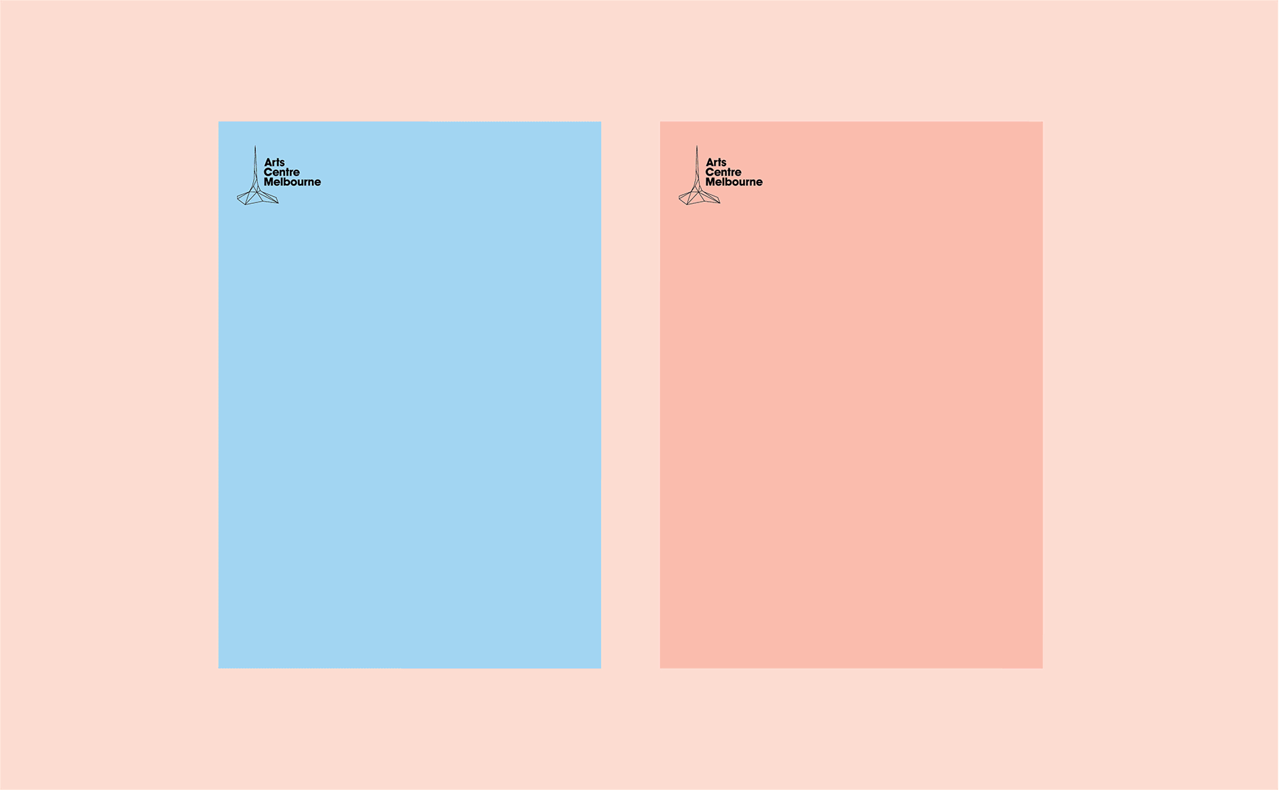
With the Brand Strategy firmly in place, we undertook a full Brand Touchpoints audit, to ascertain what needed updating and the order of priority. With only a very small tweak to their existing spire Brand Mark (to optimise it particularly for online), we took a look at all the existing Brand Touchpoints of which there were many, and many were black and gold and positioned Art Centre Melbourne as a more exclusive or premium brand.
Because the new positioning called for a swinging open of the doors of Arts Centre Melbourne (moving them from exclusive to inclusive), we wanted to open up their colour palette, their style and their approach to the look of their brand. Collectively we had to ‘get over’ the fact that the physical space of the Theatres Building (plush red carpets, gold railings and dark hidden ticketing area) wasn’t going to change in the immediate future, but everything else could. Website and digital assets, signage, invitations, fund raising events, programs, advertising, presentation decks, member packs all needed a new look and way of expressing Arts Centre Melbourne with a more inclusive tone of voice.
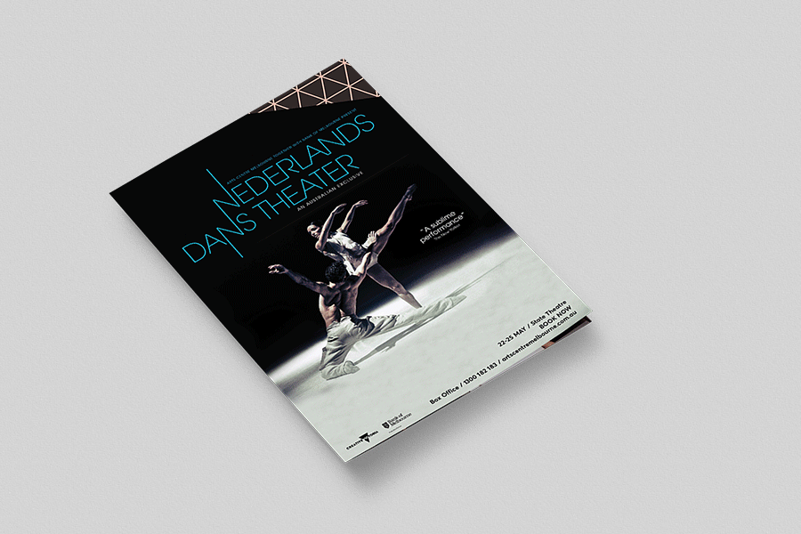
To add an extra level of complexity Arts Centre Melbourne had to develop its won recognisable brand language, whilst also allowing itself to become the ‘picture frame’ for other brands – or shows.
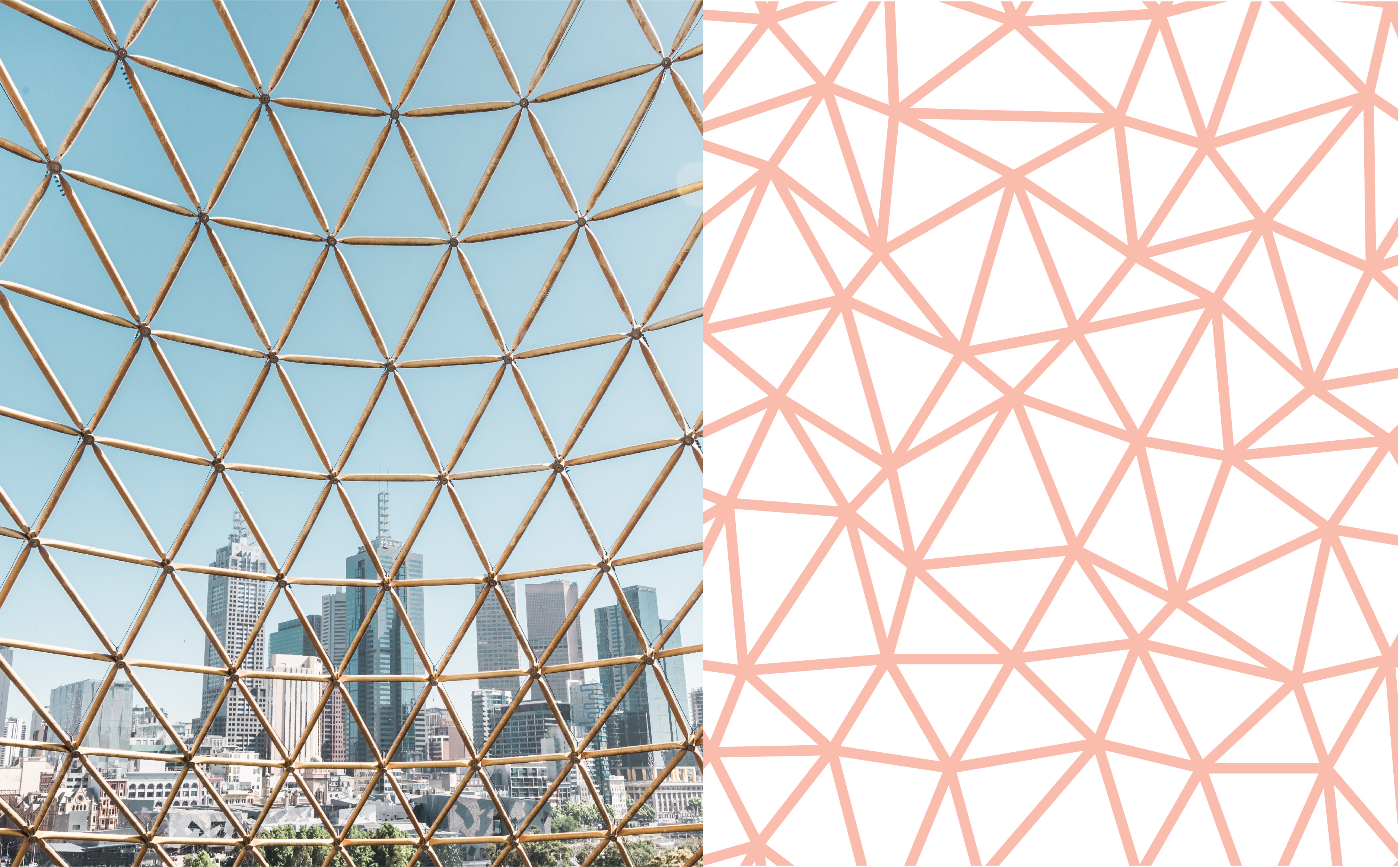
So armed with all this as a brief, the Brands to life® creative team developed a triangular, modular system inspired from the iconic Arts Centre Melbourne spire. A distinctive geometric pattern cut from the Arts Centre Spire designed to provide added texture, dimension and a sense of space.
The Polygons or triangular like transparent shapes were also inspired by stage lights. When these shapes cross over each other and come together, they create a central highlighted area, adding creative energy an a focus point that brings everything together. The system was created to use freely and more randomly to provide flexibility depending on the photography and designed to break up any linear compositions.
The system, that also features an extensive colour palette, allows for consistency but flexibility. The ability for Arts Centre Melbourne to more heavily brand themselves when the communications call for it… and dial back their own branding when a particular show needs to take centre stage. So while every communications piece has its own unique feel, it’s very much part of the distinctive Arts Centre Melbourne Visual Language.
During 2017 the new visual identity started to roll out to all newly created Touchpoints and in the first half of 2018, Arts Centre Melbourne’s new website by Bravo was launched. There is more to come as Arts Centre Melbourne really opens its doors to Melbourne and the performing arts industry to bring people together for remarkable experiences.
And speaking of opening doors, since the brand re-positioning, Arts Centre Melbourne has opened its doors to become home of the permanent exhibition, the Australian Music Vault. Another brand we developed with the team from Arts Centre Melbourne, Creative Victoria, Music Victoria and other key players in the Australian music scene.
See the brand identity for another iconic Melbourne brand in the making, the Australian Music Vault.