BRAND MARKS
Brand Mark V Logo
You’ve heard of brands, who hasn’t? And you know what a Logo is… but what is a Brand Mark? “Isn’t that just the same as a Logo?” we hear you say (we hear this all the time). Let’s pump the brakes and brew yourself a cup of whatever’s good, and we will try and break it down for you.
Understanding ‘the Brand’ & ‘the Mark’
To define a Brand Mark and explain how it’s different from a mere Logo, we will divide in order to conquer.
As with many compound words, in order to understand what the words mean together, it’s helpful to pull them apart and define them individually to begin with. Then, when we put it all back together, we’ve got a better understanding of what they mean as a whole.
The Brand
Let’s just be super clear, a Logo is not a Brand. A ‘Brand’ works on a far deeper level than a Logo. Think of a Logo as a symbol that identifies an organisation or product, something we visually connect with, whereas a Brand is something that we emotionally connect with. A Brand is less about what we see on the surface, and more about what we can’t see, what we feel when we come in contact with a Brand. Connecting with a Brand is all about the ‘feelings’ reasons rather than just the visual or rational reasons it resonates with you.
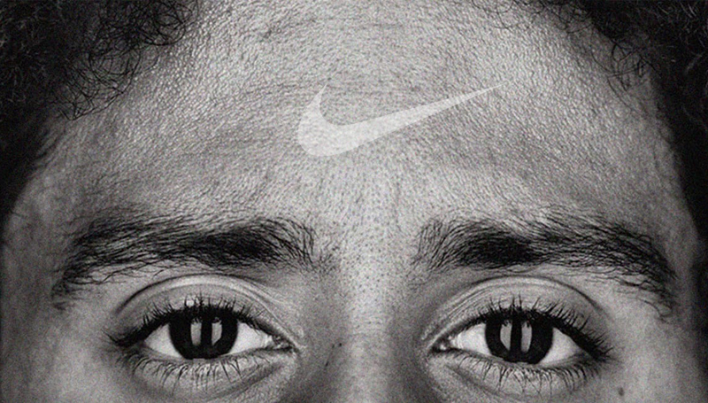
Think about how you feel when you see the brands ‘Apple’ or ‘Nike’. There’s a feeling that hits you right in the guts every time you see these Brand Marks. Like them or not, the reason you get this feeling, is because you are emotionally attached to the Brand in some way. This is the core idea behind branding, to get you emotionally hooked.

The Mark
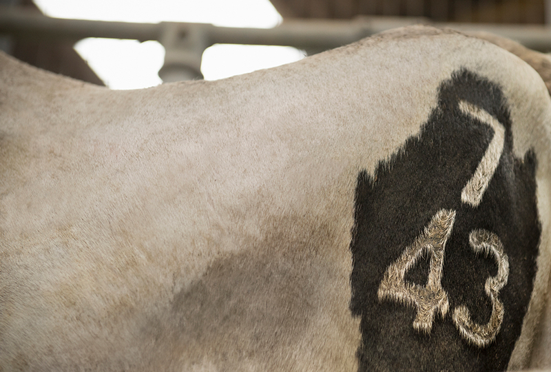
A ‘Mark’ is exactly what it sounds like. A symbol, something for you to visually identify. A Logo serves as a visual shorthand or the organisation’s signature. Think of it like a symbol that’s been hot stamped with a branding iron onto the hide a jersey cow. You know who owns the cow but that’s about all – you don’t know much more about it.
So, what is a Brand Mark?
When you put the two words together, we have a ‘Brand Mark’. Put simply the reason it’s called a Brand Mark (two separate words) is because it’s the mark that heads up your brand.
A true Brand Mark will be designed with a clear understanding of your Brand Strategy and Brand Positioning. Without understanding these key components to begin with and bringing them into the development of a Brand Mark, the resulting visuals won’t feel like the brand they represent as the Brand hasn’t actually been determined. So, without Brand Strategy that your mark seeks to represent, then you’ve got a Logo and not a true Brand Mark.
Why create a Brand Mark?
A Logo may do its job on a business card or flyer, but how does it relate to the bigger picture thinking of your Brand? And how does it work when you apply it to every Touch Point your Brand has?
This is why we create Brand Marks, and not Logos. (And why you should too!)
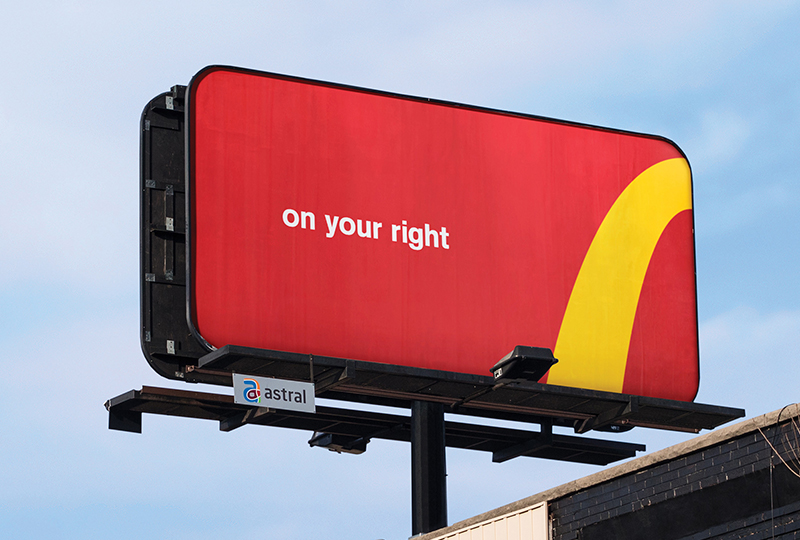
A good Brand Mark looks great, is well considered, lets us feel the brand, and makes sense where ever we see it.
When is the right time to create a Brand Mark?
Obviously, the best time to create a Brand Mark is at the start of the Brand’s development. But as the old African proverb goes “The best time to plant a tree is 50 years ago, the second-best time is now.”
New Brands – As soon as you have locked in your Brand Strategy, you will have a brief to start developing a Brand Mark rather than just a Logo.
___________________________________________________________________________
Refreshing Brands – Your Brand Strategy is right but your existing branding is tired. A refreshed Brand Mark and Identity can keep you relevant.
___________________________________________________________________________
Full Rebrands – Your entire business model needs an overhaul. Review Brand Strategy, Positioning, Brand Mark and Identity accordingly.
___________________________________________________________________________
If you’ve got a Brand but not a true Brand Mark, or you have a Brand Mark you don’t like, or if after reading this you think you might have yourself an emotionless Logo clogging up the bottom of your emails and fuelling the nightmares of everyone you come in contact with (my font-paralysis is a real thing!), then don’t worry, you’ve got options.
You can get crafty, grab yourself a sketch pad and a fistful of sharpie markers and scribble to your hearts’ content. But if you’re serious about having a Brand Mark that connects deeply with people, you’ll need a bit more research on your brand. More on that later.
If you feel that you need a new Brand Mark but can’t find the time or the budget to do something about it, think of it like a haircut. Putting it off, isn’t going to make you look any better, and eventually you’re going to have to go for it.
What are the benefits of a powerful Brand Mark?
When you truly understand the thinking behind your Brand (through Research, Planning and Strategy) and understand all the relevant and potential Touch Points for your Brand, you can start creating a more effective Brand, a Brand that packs a punch in all the right ways.
And one of the main ways that successful Brands show who they are, is through a well thought out and beautifully applied Brand Mark and accompanying Visual Language to work with it.
Benefits range from people associating your Brand Mark with your values and understanding what sets you apart from your competition, through to the extreme – like people having it tattooed on their legs. (Another reason to make sure you have a good Brand Mark).
The main benefit is always going to be, having a visual representation of your brand that connects people to your brand. Just like the ‘Nike’ and ‘Apple’ Brand Mark examples from earlier, regardless of how you feel about them, these Brand Marks provide connection between people and your brand. They trigger the emotions, no words required.
What should a successful Brand Mark brief include?
There’s no rule that limits how many squares a Brand Mark should have, or at which angle a triangle should interact with a rhombus. In the design world, it’s all good.
What you do want to have up front and included in your brief is:
____________________________________________________________________________
Clarity on your Brand Strategy
____________________________________________________________________________
An understanding of all your Brand Touch Points
____________________________________________________________________________
A clear outline of any mandatories to consider
____________________________________________________________________________
The first secret ingredient every good Brand Mark has, is understanding who you really are as a business/organisation/product/service and it begins with research and brand strategy. In order to have a Brand Mark that resonates well with the people you want to reach, you have to know who your brand is. Are you a music label that only signs on heavy metal bands? Then a turquoise coloured Brand Mark with a cartoon peacock and Papyrus font probably isn’t for you. It can be easy to work out what you don’t want your Brand Mark to be but in order to find the right one, you need to dig deep into what makes your brand tick.
Secondly too ensure it will work as best it can, and to avoid becoming yet another Logo tucked into a corner, another key factor to consider up front is what the main applications of your Brand Mark will be. Each and every brands’ Touch Points are different, but you should consider the most relevant for you – from the tiniest social icon, to your website or shopfront, right through to fleet vehicles, packaging, uniforms and advertising. Your Brand Mark should live in these different spaces effectively.
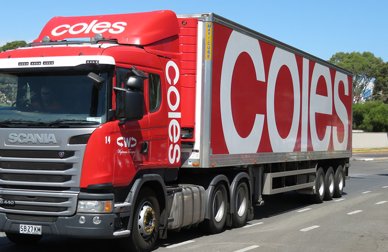
Coles do this very well with maximising their Brand Mark size on their delivery trucks, they have clearly considered this as one of their major Touch Points when developing their updated Brand Mark, it’s a very effective use of space on this very important Touch Point. It’s effectively a billboard on wheels.
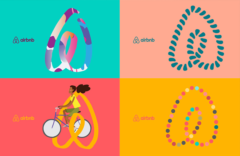
Airbnb another good example of a Brand who has a lot of flexibility in the application of their Brand Mark, its constantly evolving. The freedom they apply to the use and form of their Brand Mark is akin to the great sense of freedom you feel when you’re travelling.
And finally, ensure that any mandatories are written in the brief. A lot of hard work goes into creating Brand Marks and Visual Identities. You need to ensure there are no ‘No-Go Zones’ ie colours, fonts or keeping away from particular looks that a brand stakeholder can’t stand. Understanding the competitive set so there’s no chance of wasting time developing an idea that’s already (unknowingly) taken, and finally clarify the client understands the difference between a Brand Mark that is a word mark, and a Brand Mark that includes an icon or device as part of it. Some clients can be very specific in their desire to see one or another.
How do you create a Brand Mark?
At Brands to life®, as you may have guessed from our repeated hints, we love research. This doesn’t mean sending your brand off to a lab to have 100 random members of the public pull it to pieces and then tell you it’s broken. Instead we love getting to know brands. Whether it’s a passion project with one staff member, or a national brand with thousands of stake holders, we treat every brand like an individual.
What makes them tick? Are they fun loving or serious? Do they value simplicity, honesty, both? There are no wrong answers but drilling down and helping brands choose what truly represents them is how we get a picture of how they want to be represented visually.
From there, we get creative! Our team of designers and creatives do the tough stuff, turning ‘what makes your brand, your brand?’ into a crafted Brand Mark designed to get the attention of the people you want looking at you.
We wish it was as simple as rolling a dice where ‘odds’ means a triangle and ‘evens’ means a square, but we pride ourselves on creating Brand Marks that encapsulate what a brand is really all about.
Quick steps to creating a Brand Mark
Research – Understand the world your brand is living in from a stakeholders, customers, competitors and desired positioning POV.
____________________________________________________________________________
Strategy – Clarify your Brand Strategy. You will need this to make objective decisions on Brand Mark concepts.
____________________________________________________________________________
Creative – Develop Brand Mark concepts, including Visual Language, using your research insights and Brand Strategy as the brief.
____________________________________________________________________________
Trademark – Make sure you can own your Brand Mark. Basic desktop and IP searches pre-concept presentation. Full IP search/trademark application of preferred concept/s.
____________________________________________________________________________
Brand Mark creative – some more detail from our Design Director
Thinking – Idea generation to articulate your strategy
____________________________________________________________________________
Sketching – Freehand sketching of multiple concepts
____________________________________________________________________________
Refining – Decide on two or three sketched ideas
____________________________________________________________________________
Creating – Get on the tools and design the concepts for the Mark and the accompanying Visual Language
____________________________________________________________________________
Creating a Brand Mark starts with an idea. This idea is developed around how to articulate the Brand Strategy/Simple Truth in visual form.
Once we have a solid foundation, we pick up a pencil and start sketching things out. Yes – the humble sketch will demonstrate the idea more than pixel pushing ever will.
It’s at this early stage when the creativity is flowing the fastest. So this is when we try to pump out as many expressions or variations of the theme as possible. Most of which our clients will never see.
The next stage involves selection and refinement. We choose the sketches that show the most promise based on how well they can articulate the strategy and how well they will be applied to not just a Brand Mark, but to the wider visual language that will express the Brand.
The lucky few sketches are then refined using graphics software, adding colour, type and imagery to flesh out a full system – ready to apply to Touch Points like Websites, Social Media, Packaging, Corporate ID and eventually Advertising etc.
Our client will usually be presented with two Brand Mark and Visual Identity options before refining to one. The tighter your strategy, the fewer concepts you’ll need to get to see to get to a Brand Mark that truly represents your Brand. Why two? Budgets. Our clients are welcome to see as many concepts as they like – but obviously costs increase with each new concept developed. Why not one concept? Well, what can we say… people like choice.
Brand Marks created by Brands to life®
Here’s just a few examples of Brand Marks we’ve created using the steps listed above. If you like them, click through to see how we have applied the thinking and rolled out the visual language. Remember a Brand Mark without a brand, is just a logo. It’s not just about the Mark, it’s how it lives and what it says that counts. We hope you like them as much as our clients do.
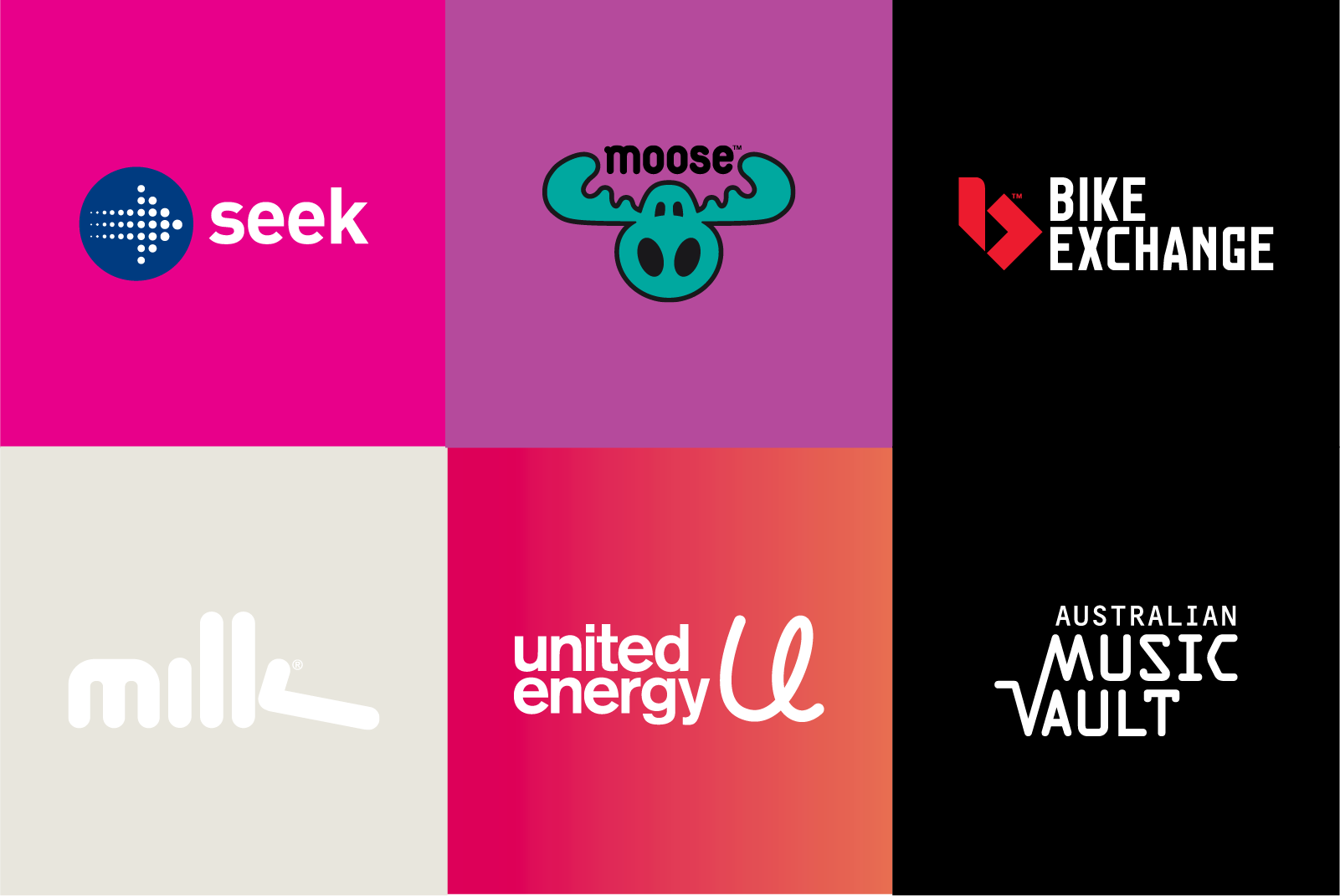
For more examples of Brand Marks we have created, see our Brand Identity work.