CHALLENGE
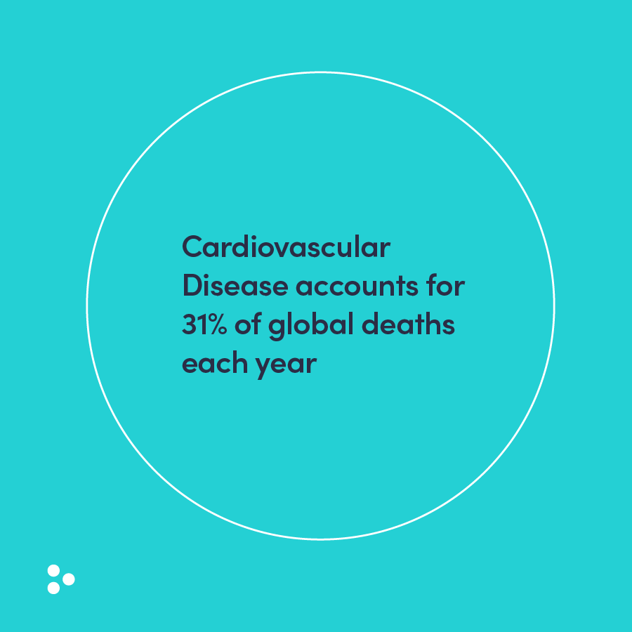
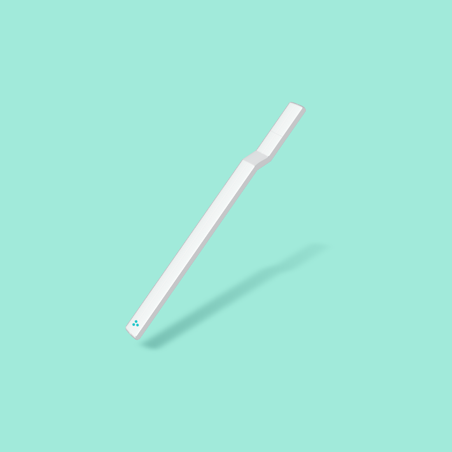
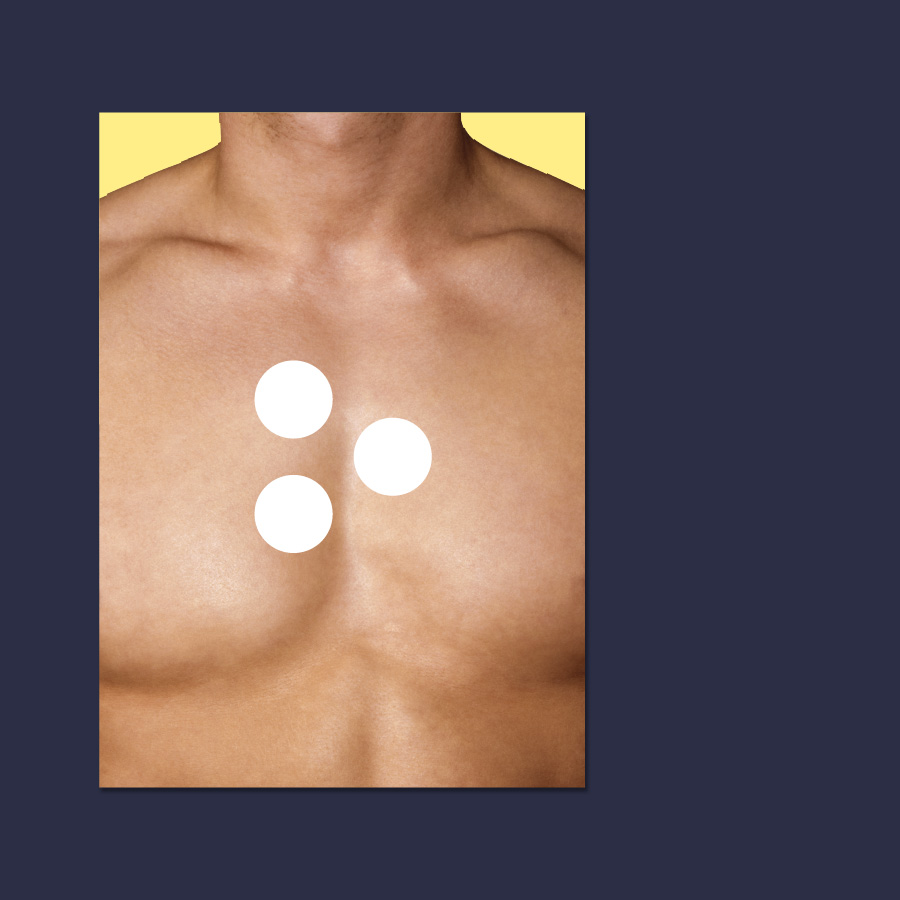
MedTech company ESN Nanotech have developed a world first, potentially life saving device. By using the latest scientific advancements in nanotechnology they are creating a simple home-use, hand-held product to detect bio markers of heart disease from saliva. We were approached to create a brand to simplify the story to engage investors and drive understanding and demand from potential future customers.
THINKING
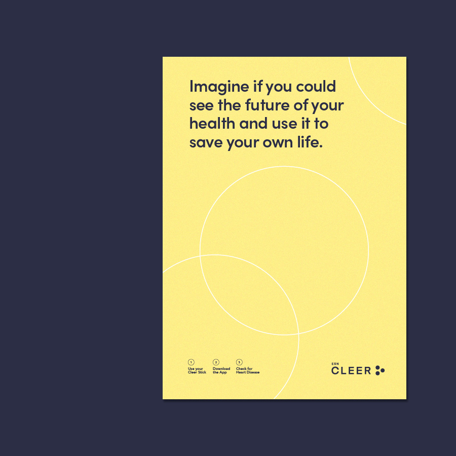
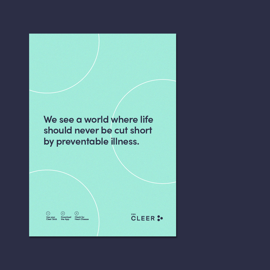
The Simple Truth ‘We help you life longer’ was the springboard to ‘The Future is Cleer’ positioning. The brand name CLEER speaks directly to the customer in an effortless way, as well as talking to the unique and transparent lick, stick and activate process. The solid block colouring of yellow and light blue reflects CLEER’s fresh and modern approach to heart health. The three dots in the brand mark represent the three simple steps in the process to see your future health.

IMPACT
A multi-partner deal had been signed to bring this life-saving technology to market by 2021. The collaboration between ESN Cleer, RMIT University and the innovative Manufacturing Cooperative Research Centre (IMCRC) are now researching and developing the device for pilot manufacture. The CLEER story has already been picked up by various medical and manufacturers journals and recently 7 News.
See the news segment here
Brand Strategy + Brand Naming + Brand Positioning + Brand Story + Brand Identity + Digital Design