How Uber lost its ‘human’. The rebrand 3 months on.
Trial free trips home from dance parties or rides to Top Shop in Mini Coopers? Yes please!
Forward to a friend and get them $10 off their trip home? Sure, that reflects just the sort of good friend I am. Deliver me a kitten…? Stop it! This is just too good!
The human face of Uber was refreshing. Drivers you could rate. They wanted to impress you, they offered you mints for goodness sake (hang on – what were they trying to say?) Turns out, Uber was more reliable and cheaper (surge aside) than taxis. You could see how far away your ride was. So easy to book – and no messing about with cash or cards at the end of your journey. What wasn’t to like?
But when they rebranded earlier this year we thought it was a bit of a car crash (pun intended)… its rebranding has become a complicated story about bits and atoms. It left us wondering, if Uber had managed to lose its ‘human’? Let’s take a look at the rebrand 3 months on.
The 2-Minute Uber brand history
Uber says it began life as a ‘black car service’ for 100 friends in San Fran and positioned itself as ‘everyone’s private driver’, yes it’s had a few iterations of its brand mark since the early days but it’s all been based on people. Personal, easily understood, it humanized the technology behind it and this is how we understood it when it arrived in town.
Uber has been part of a generational change, as brands move from consumers dealing with stiff corporates, to a more human approach, where people interact with other people, creating greater intimacy in commercial relationships. Its march through new markets in over 400 cities and 65 countries has not been without controversy, (but taxi industry aside) it has managed to become the ‘people’s brand’, making both drivers and riders alike more than happy.
This year, with the release of its new logo and identity and the rationale behind the change, it was more than a brand refresh – it was a full rebrand from the strategy up. Like many of our peers, we were naturally curious to learn about the changes and we’re not really surprised at the universal thumbs-down that has resulted. Customers, the very people who support the brand being considered atoms? Not very personal. Certainly not very human.
Obviously we’re not privy to the business decisions Uber is making but from a strategic branding perspective, these are our collective thoughts on their rebrand.
#1: A strategy that doesn’t put humans first is not very likable.
Uber’s explanation for its rebrand is that the world is made up of bits (their technology) and atoms (the people that use their service) and the new branding reflects this. Really? This was always destined to raise eyebrows in the brand community. Brands are – and have always been – the practices and devices companies use to create real, human, intimate connections to people. So while a focus on being in the ‘Transportation Business’ and on bits and atoms might work for robots, it tends to fly in the face of what we know works with people.
So how has this new strategy affected Uber’s brand touchpoints?
#2: The App Button – Uber’s Worst Mistake.
For us, the most obvious issue with the new branding is the design of its App button, the number one touchpoint through which a consumer or driver connects to Uber and to each other. From a visual language point of view, this button was always the most important element to get right up front.
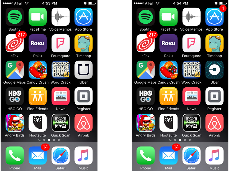
“What emerges from the Uber rebrand is akin to wallpaper, a button that doesn’t pop in a busy smartphone screen. Think of the phone’s screen as competitive retail space – Uber’s new design and colours make it hard for people to find it at its primary point of sale,” says our Creative Director, Paul Findlay.
“I really think this is a classic case of overthinking taking over brand application. Uber has forgotten the most important thing – its customer.”
5 Steps to a Better App Button
Step 1:
If you’re updating your app button, start with the customer experience. Take the time to research what works well with the button you have and capitalise on its strengths. In many cases, updating the app button should be a case of evolution, not revolution.
Step 2:
Review competitive brands and other app buttons that compete alongside yours for eyeball attention. Screens are busy so your app button needs to stand out. Don’t copy, create something unique to give it lift.
Step 3:
Design your app button with a brand pop and some kind of a visual brand hook in mind – your app button must reflect your brands cues and brand values. For example, the Twitter bird icon is the perfect icon and visual brand hook to help aid brand recall (this makes it easier to find in a sea of buttons on your phone). It’s also clean and strong – and the fresh blue really pops.
Step 4:
Add your app to a mock screen layout so you can see how it looks in situ. Do this at design stage so you’re not messing around once your app is built.

Step 5:
Test it. Select a shortlist (3-5 is fine) of your favourite app button designs and run it past people to gauge their response. Start with smaller groups, like people at work and friends that you feel are relevant to your target audience. Take it to research groups if your still not convinced. Be sure to ask the right questions. Ie. Why does this pop the most to you? What do you think of when you see this button?
#3: Uber’s Country Tailored Colour Palette – What for?
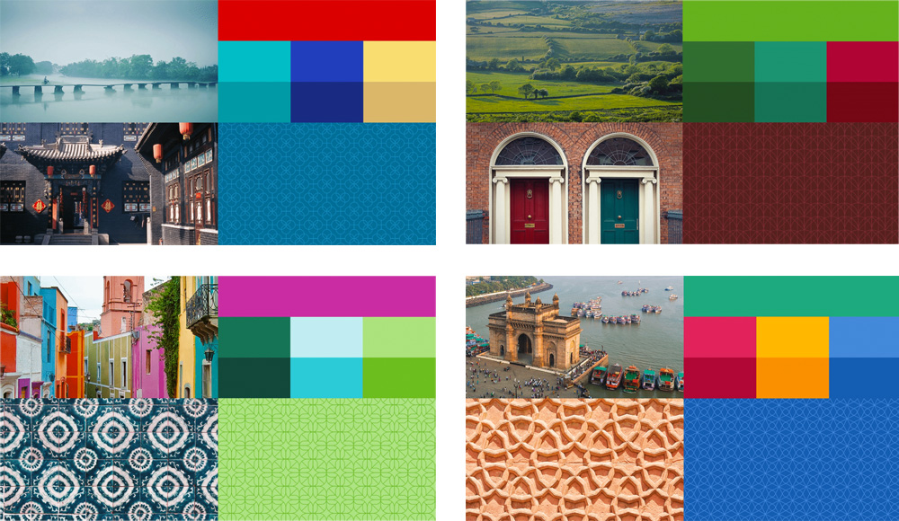
For a brand that prides itself on simplicity in service, the brand strategy is remarkably complicated. Uber has designed colour palettes for the various markets in which it operates. Why?
McDonald’s golden arches are the same the world over; so is Coca Cola’s logo. Brands work because of consistency and repetition – and the sense of security and trust the consumer has knowing that the brand is the same, wherever you are in the world.
In Uber’s case, we see it as a case of trying to fix something that wasn’t broken to begin with.
#4: Uber’s Overall Brand Look and Feel.

Branding is a tradition that remains both relevant and important. Change for change’s sake can be disastrous, as many brands before Uber have discovered to their detriment.
“Uber’s rebrand feels very robotic, tech like, rather than more human, more real. This suggests a disconnect somewhere, either in brand planning or in creative execution,” says Paul.
The rebrand of Uber leads us also to conclude that Uber isn’t clear about its business – and if you don’t know what business you’re brand is in, how will your consumer know?
Uber’s new-look brand has all the appearance of a tech company, the sort that might manufacture widgets for computers. Yet this conflicts with the consumer’s very human brand experience and this fundamental disconnect, we believe, will force the company to revisit its branding strategy – and soon.
Anna Rogers
Anna is the Managing Director at Brands to life®, an award-winning branding agency that creates memorable and authentic brand experiences. With over 25 years in the communications industry,Anna is focused on the emotional connection between brands and people. Launching or relaunching brands, making them relevant again, helping brands catch up to and surpass the competition or just breathing some new life into brands. Refining brand strategy to solve problems and drive growth for businesses is what gets Anna up each day. Usually way to early.
Our Final Rap.
In this blog post written two years ago, Kalanick described Uber’s most valuable assets. It wasn’t drivers or customers – but bits and atoms, a hat tip to Google Ventures (bits) and private equity firm TPG Capital (atoms). Two years ago…. so the direction for this change in strategy seems like it was directed from above and has been more than a while in the making.
Uber is a new brand that wants to grow up. So said CEO, Travis Kalanick, who told the US media at rebrand launch this year that Uber had reached a point where it knew who it was and wanted its brand to reflect it. Nothing wrong with that, so far.
The real brand disconnect happened because it focused on its tech roots rather than on the humans that participate in its brand.
Not surprisingly the rebrand jars.
Perhaps Uber sees this as just a blip on the radar – it has other more pressing growth challenges to focus on. But our point is that if it doesn’t own the hearts of its audience, then a competitor can.
Time will tell. Either Uber will fly even higher, or it will explode, filling the cyberspace with its mass of bits and atoms. Or maybe they will do another, more human rebrand, that puts people first… either way we will all be watching with interest.

