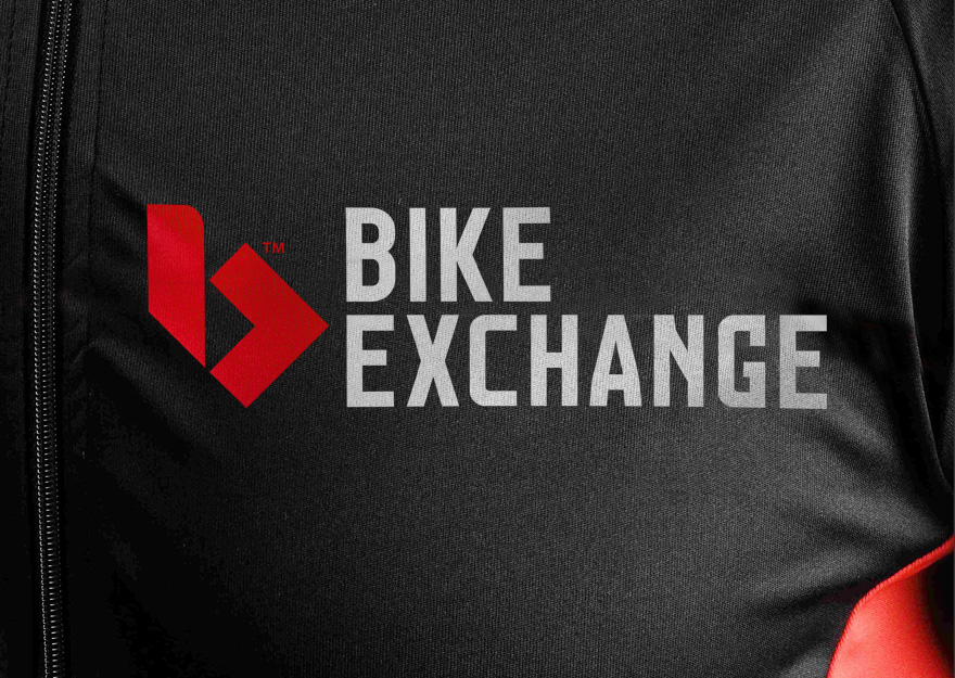
BikeExchange Rebrand
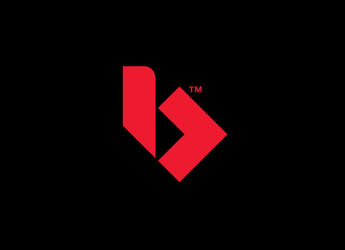
An exciting rebrand for the worlds’ largest bike marketplace.
BikeExchange.com.au have sharpened up their look to increase their digital brand footprint and allow them stand out from the thousands of product and retailer brands they facilitate sales for every day. They are fast becoming the brand that all riders, across all disciplines are happy to wear. The new look streamlined ‘b’ was designed to encapsulate the three main rider disciplines represented by a straight line for Road bikes, a jump for BMX and a steep decline for Mountain bikes. The distinctive arrow on the BikeExchange ‘b’ reflects the forward thinking and driven nature of the Bike Exchange business. Look out for this brand and brand livery in 2016, something tells us you might be seeing a LOT more of it.