CHALLENGE
The team at Hobart Brewing Co. wanted to find a way to tell their own story and stand out amongst the proliferation of craft beer brands and micro-breweries throughout Australia.
THINKING
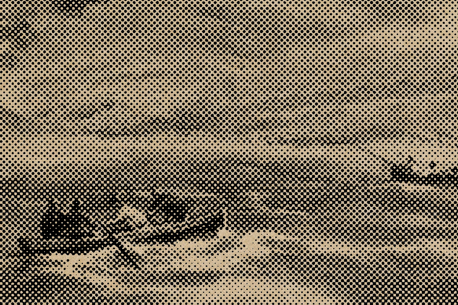
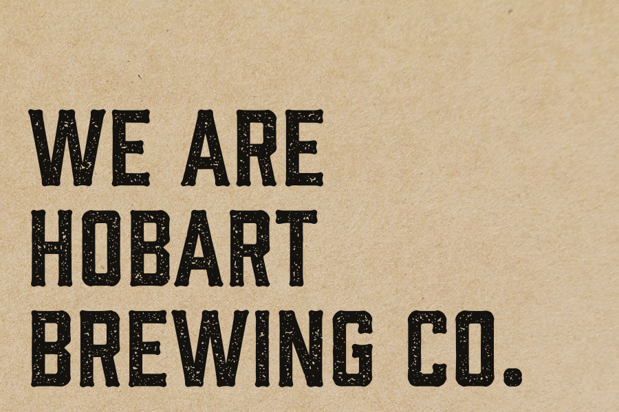
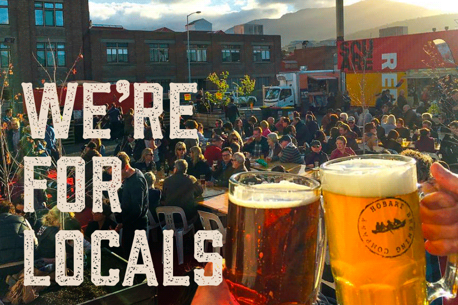
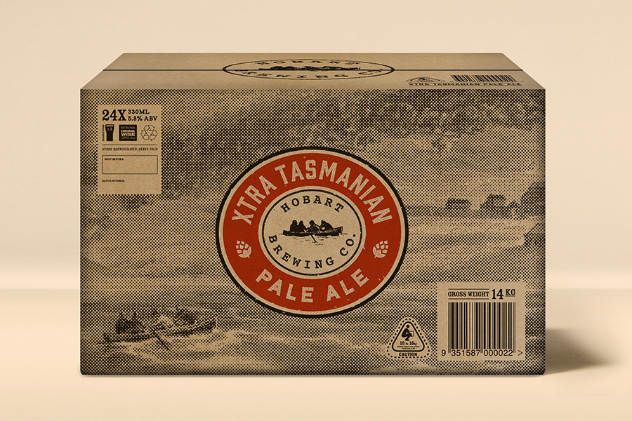
Hobart has a history as a great brewing town and is still one of the best places on earth to brew good beer. They wanted to make beer that ‘locals want to drink’. To help make the brand ring true to it’s origins, a visual language was developed, inspired by a 1833 painting from by G.P.Reinagle which shows early settlers arriving to shores of the soon to be names Van Diemen’s Land by boat. This was complimented with weathered and archival like typography to reinforce the made made aspect of the beer making process.
Brand Strategy + Brand Positioning + Brand Story & Voice + Visual Language + Label Design + Product Packaging
Created By