CHALLENGE
A change of ownership prioritised the re-brand of United Energy. The business needed to become less utility and a more people-centric brand from the inside out.
THINKING
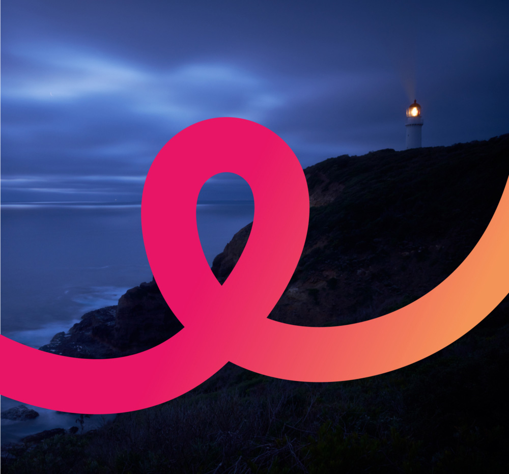
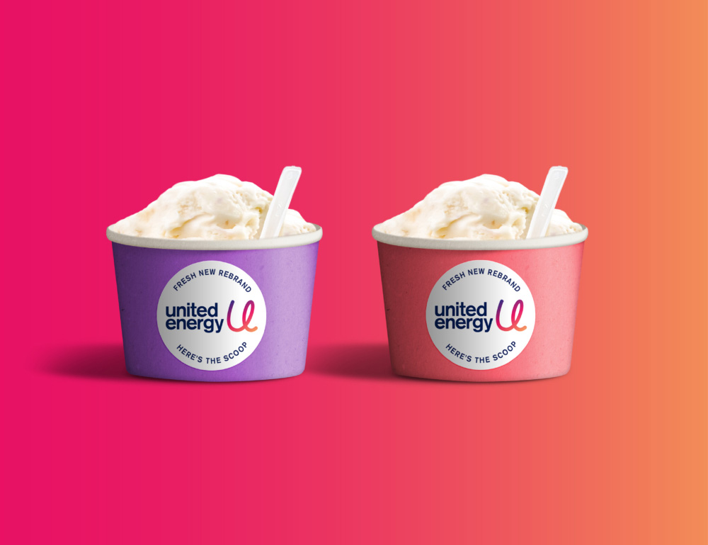
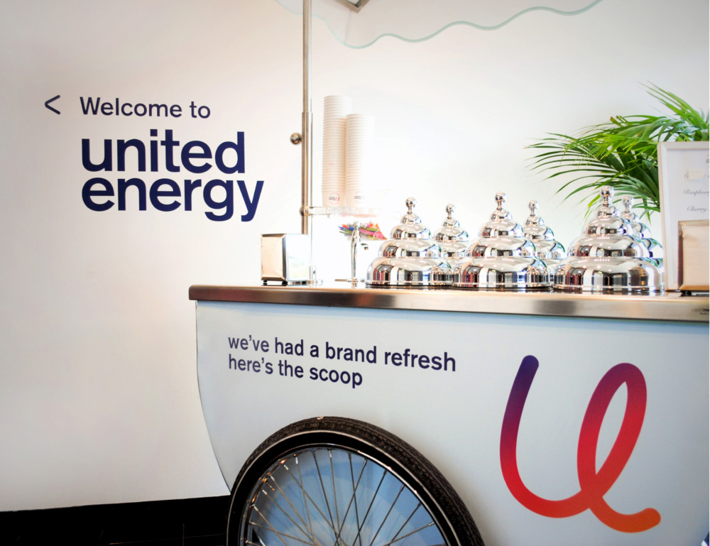
A new identity was developed to re-invigorate United Energy. Based on the idea of providing customers with ‘effortless energy’, the super fresh, vibrant branding was unveiled to staff when they arrived at work on a Monday. A new office fit-out and a big internal launch presented by the CEO (along with some zesty gelato to introduce the fresh new approach) revealed the new strategy and vision for the newly re-freshed United Energy brand
IMPACT
From a utility company to a brand. The authentic story we uncovered after working with the employees and key stakeholders set the road map to ensure that first and foremost employees embraced the new direction for United Energy, long before taking the new identity to market.
See the re-skinned United Energy Website
Employee & Key Stakeholder Research + Brand Strategy + Brand Positioning + Brand Story & Voice + Brand Mark + Visual Language + Website Design + Digital Design + Office Fit-out + Way-finding + Internal Stakeholder Launch
Created By


