CHALLENGE
Australian door hardware business – Entro – wanted to reposition themselves to connect with a broader audience, particularly more architects, specifiers and interior designers for both commercial and resi builds. Their products, price and service were all in excellent shape, with a true focus on collaborating with clients but the way Entro was expressing itself and telling their brand story needed an overhaul.
THINKING
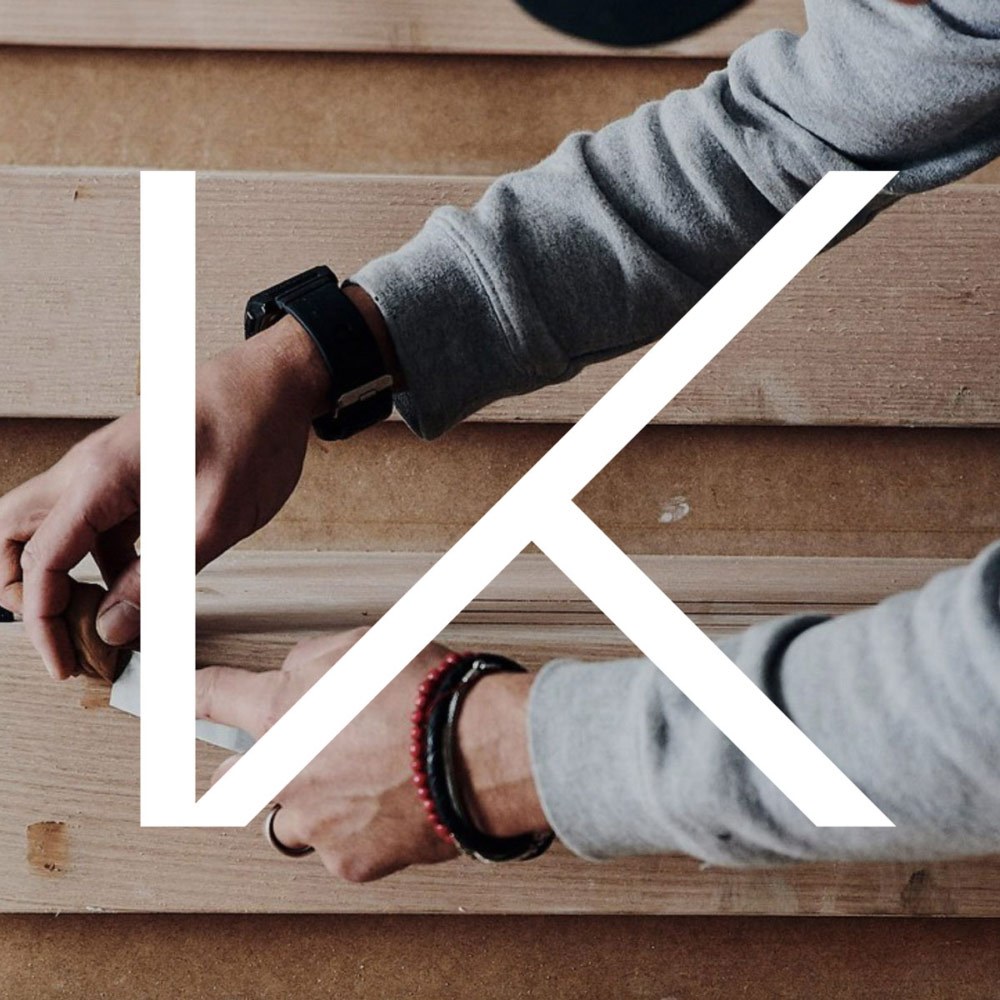
With a brief of ‘making premium more accessible’, our approach to Entro brand identity was to make it feel as much at home etched into the steel of any ‘doorware’ product as it did displayed on packaging delivered to an architect. A pared back Entro word mark with a unique custom E is complemented by a bold, monochromatic visual language. Backdrops of black-on-black and gloss-on-matte with detailed crisp white typography, ensures the product is always the hero. The new positioning ‘Open Possibilities’ reintroduces the brand to its existing customer base and at the same time elevates the offering to a broader design-based audience.
IMPACT
The new Entro branding was launched in February 2022.
See the Entro website
Brand Strategy + Brand Positioning + Brand Story + Brand Identity
Visual Language + Website & Digital Design + Packaging
Created By