CHALLENGE
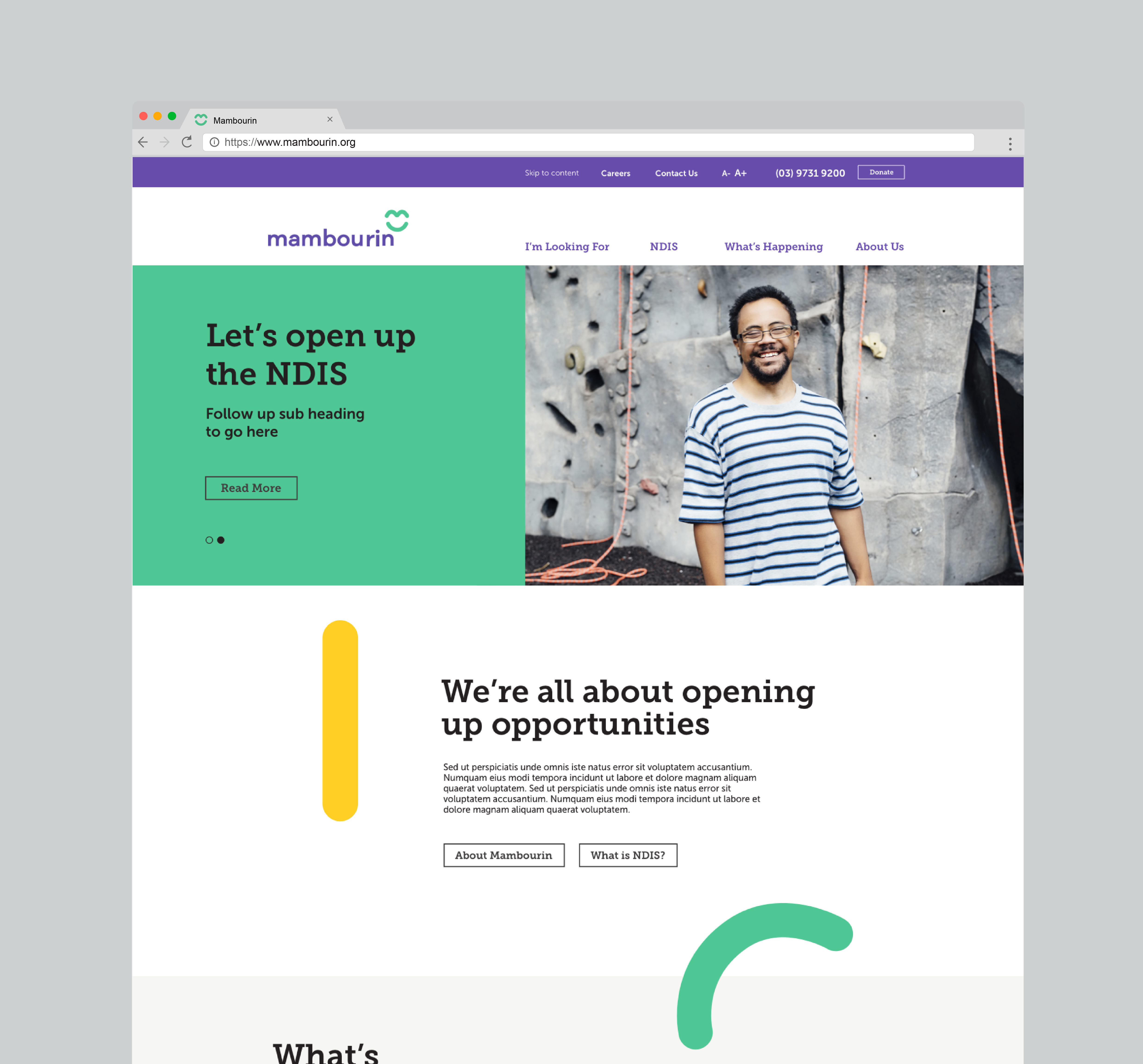
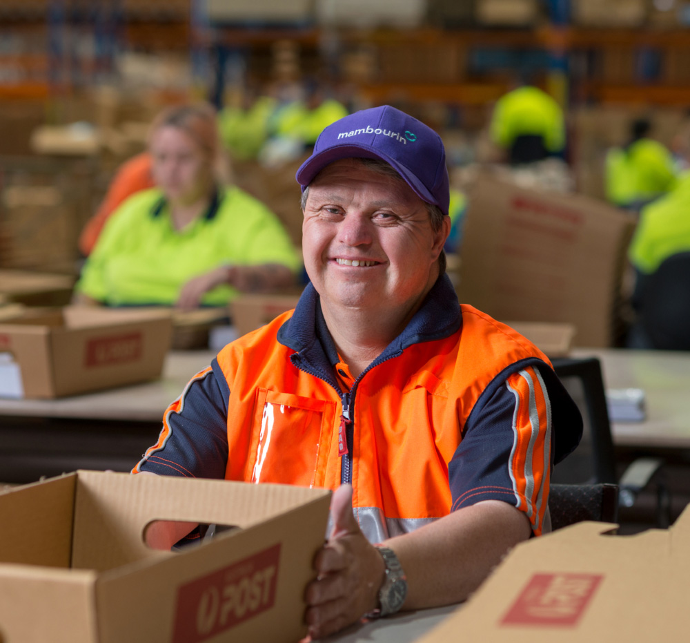
With the introduction of the Australian governments’ NDIS, 50-year-old disability service organisation Mambourin suddenly found themselves in a competitive marketplace with the ability to reach and help more adults with disabilities. They needed to re-brand to express their true colours and to tell the story of people who are at the heart of everything they do in positive, enlightening and engaging way.
THINKING
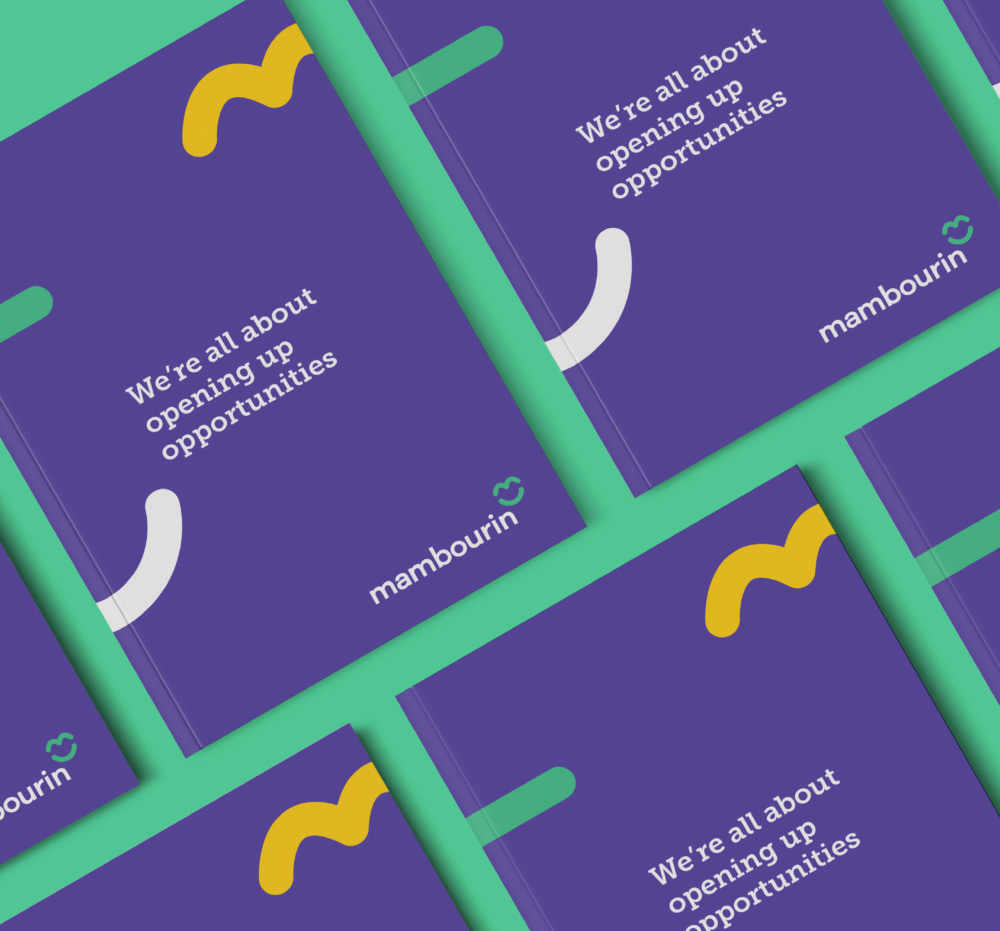
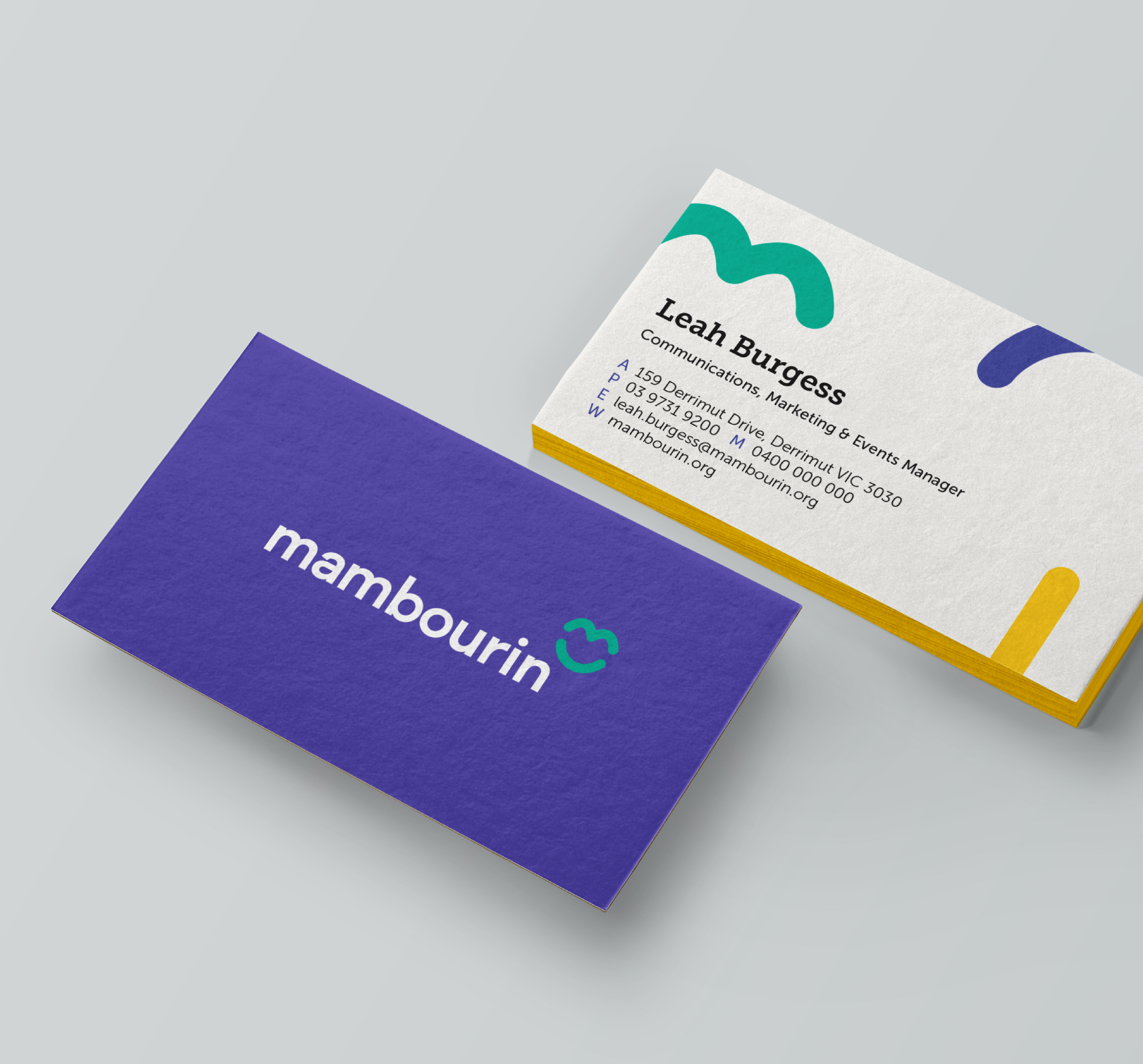
Starting with planning we uncovered the position of Opening Opportunities. This inspired a distinctively optimistic visual language and brand tone of voice, one that expressed the real essence of Mambourin in both the real and digital worlds. Never patronising, always positive, their brand talks to adults both with disabilities and without. A bright, welcoming, strong and inclusive group facilitating freedom, choice and opening new doors. Their visual language was created to express these qualities, with bright colours, optimistic shapes and friendly forms.
IMPACT
The new Mambourin brand strategy has been embedded within the organisation. They continue with the excellent service they provide to their clients and now incorporate a renewed ‘sense of fun’. This has been articulated in the major brand visual touchpoints but just as importantly, operationally within the organisation. Mambourin are living their values and opening opportunities for their employees and their clients alike.
See the new Mambourin website
Brand Strategy + Brand Positioning + Brand Story & Voice + Brand Mark + Visual Identity +Website Design + Brand Style Guide