Prolifica. Branding a Master Builder
Building a brand for a new kind of builder.
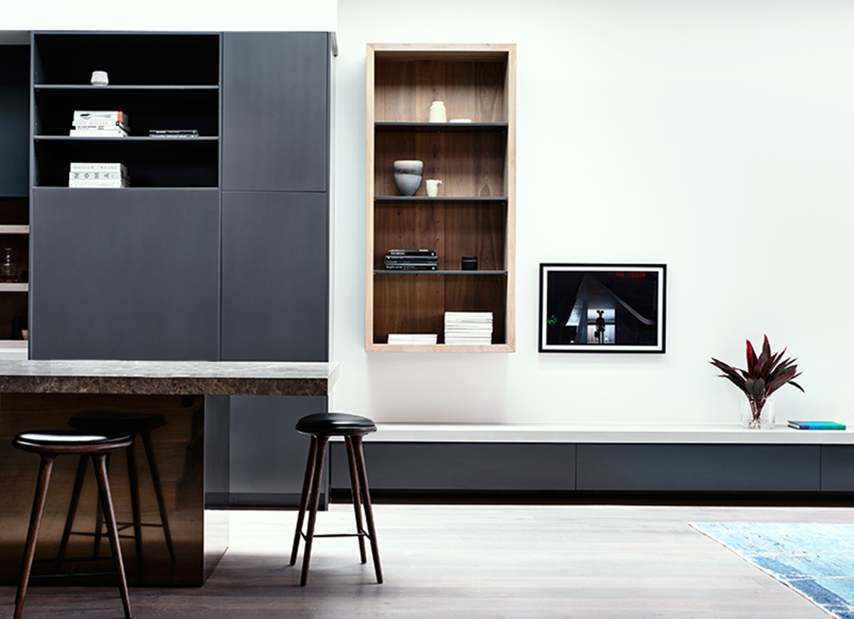
We had the pleasure of branding a premium boutique builder recently. The team at Prolifica Building Co. focus on ‘building better living’ by creating unique spaces that seamlessly combine architectural aesthetics alongside everyday function. Their work is the product of close collaboration with clients and some of Australia’s most highly awarded architects. “… this way of working, develops a much deeper understanding of what’s ‘really’ needed from the architects vision and the home owner’s point of view. We see successful projects as the one’s where everyone involved is happy and the result is a great space to live in…” says Simon Lewis, Director of Prolifica.
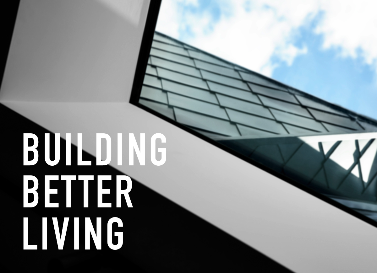
We worked closely with Prolifica to hone their brand strategy and bring their brand Touchpoints to life from brand mark creation, visual language development, right through to their vehicle livery branding and website design. The black and white, crisp, bold and minimal lines of the Prolifica identity were inspired by the form of a steel beam and the positioning ‘Building better living’ speaks to the design aesthetic of the Architect but still understands the practical nature of the home owner and how they live in their space. Prolifica’s confident brand voice and strong, paired-back, sophisticated visual identity has positioned them well in a incredibly cluttered market.
The new Prolifica brand roll-out and website launch has solidified their place in the market as a the premium boutique builder. It’s showcased their ability, projected their philosophy and captured their uncompromising craftsmanship.
Look out for their handsomely branded hoarding design (not to mention their beautifully built homes) in a fine neighbourhood near you.