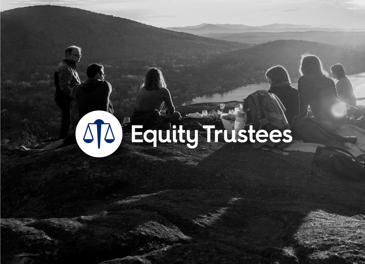
A new brand identity for 130 year old Equity Trustees
Breathing new life into a 130 year old brand.
It’s exciting to breath new life into long established brands. We’ve had the opportunity to do this recently by reviewing Brand Strategy and creating a new Brand Identity for 130 year old Australian brand, Equity Trustees. It launched last week – Friday 3rd August.
Equity Trustees will excuse us for referring to their old branding as tired, because that’s exactly why they came to see us. Many people within the organisation were lamenting that while internally they were a thriving, progressive and team oriented business, externally their brand was represented as ‘ …bland, a little bit conservative in terms of who we are as an organisation, – quite safe…’ (and these were some of the kinder words to ‘self-describe’).
With incredibly strong results over the last two years in their traditional markets and taking the first steps to develop new ones including expansion into a global market, Equity Trustees came to us to re-fresh and re-position their brand. Paying homage to its 130 year heritage but with its sights firmly on creating an authentic, modern, relatable brand to reflect where the company is headed.
“It is a relevant, modern development of our trusted brand.”
Equity Trustees Chairman, the Hon. Jeff Kennett AC holds a direct connection to the foundation of Equity Trustees in 1888 – and its original ‘brand’. His great grandfather Edward Fanning was the Company’s longest serving director serving for a total of 30 years – 22 as Chairman.
But as mentioned in Equity Trustees press release on Friday 3 August, Mr Kennett said the time was right for change: “Our new brand puts Equity Trustees firmly in today’s landscape; It is a relevant, modern development of our trusted brand. Equity Trustees is starting the next lap of its long life and the time is right to make a change as we begin our next 130 years.
Mr Kennett said “We are changing and adapting to meet changing market demands and client expectations. The brand needed to transform too – to present ourselves as a contemporary, leading trustee company with a brand that remains synonymous with trust, empathy and professionalism.”
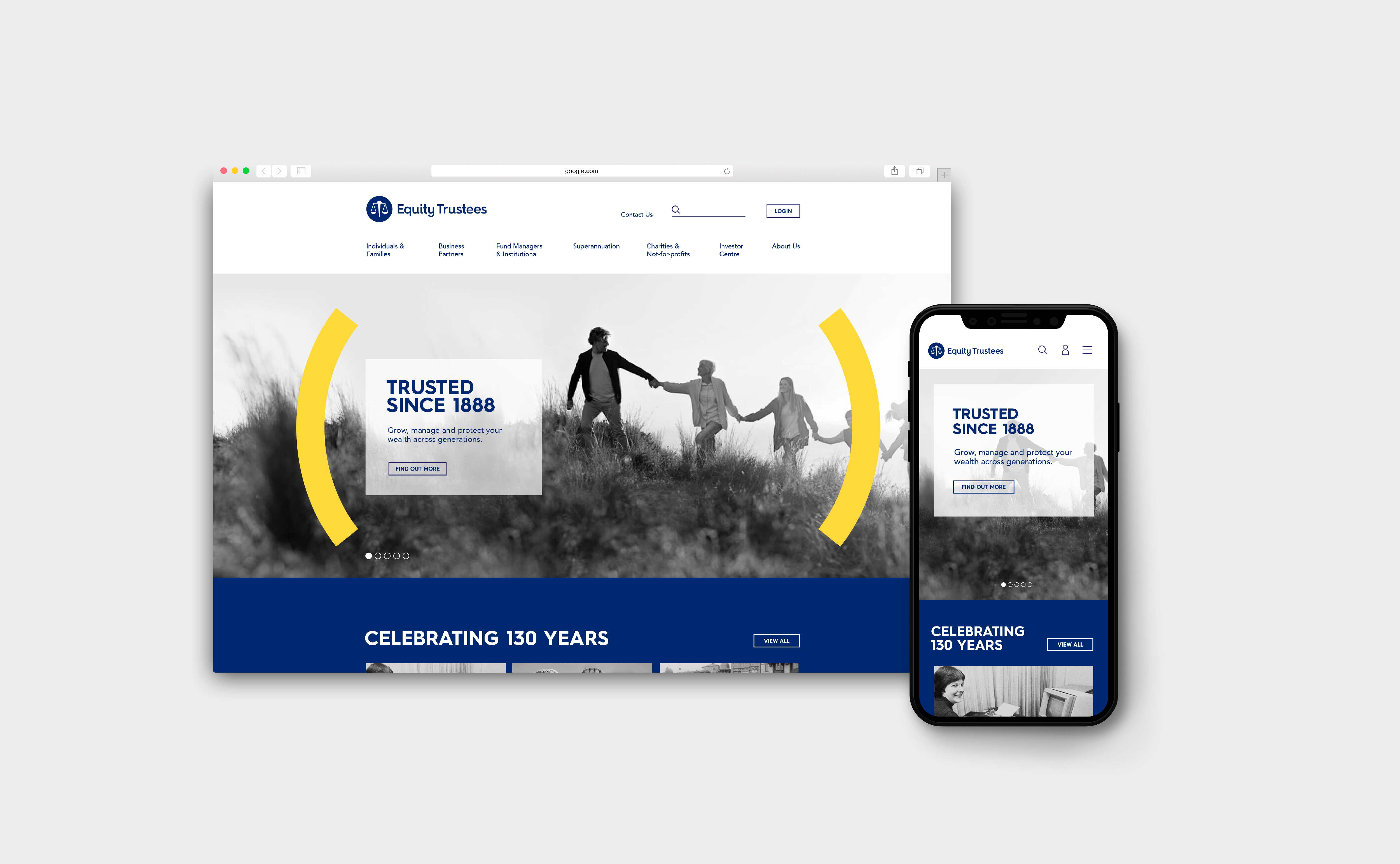
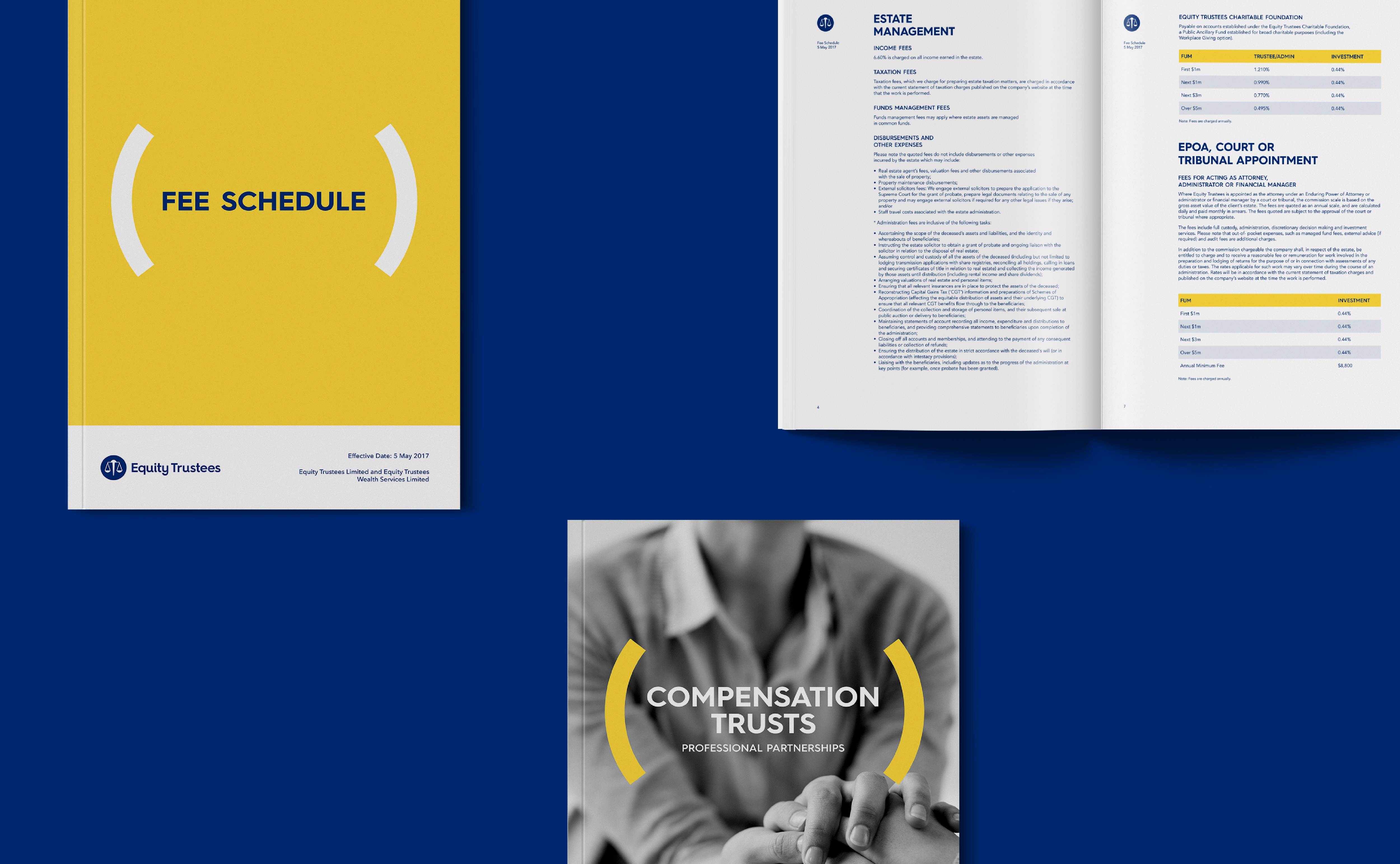
The Equity Trustees scales and well-recognised name have been retained but a strong new design element of curved brackets has been added to represent the care and trust clients place in Equity Trustees giving the traditional brand a modern look.
With a primary colour palette of blue and yellow, the blue links to the Company’s heritage, while the yellow adds a burst of energy and a splash of positivity, with a modern twist.

“A brand refresh that continues to build on trust.”
Mick O’Brien, Managing Director of Equity Trustees said that trust was an increasingly valuable asset in the current heightened risk environment in financial services.
“We have, and always will appreciate that it is on trust that we build our business and serve generations of clients. Retaining the scales in our refreshed brand mark is symbolic of our continuing commitment to balancing our fiduciary responsibilities and obligations with care and concern for our clients.”
“I am pleased to see our brand come to life with a rejuvenated look and feel, and a new energy that better reflects and represents our Company character, our ambition, our heritage and our strengths,” he said.
We’re very pleased to have been able to work with the Equity Trustee team to breathe some new life into the Equity Trustee brand… and just quietly, it is always very gratifying when a business uses our brand name (Brands to life®) to describe what we do for them. Now that’s what you call a sticky name… but that’s the topic of a different blog altogether.
If you’re interested in seeing how we re-positioned and refreshed another 100+ year old Australian brand, but this time in fashion – take a look at Wittner.