A Walking, Talking Brand.
Don’t stop at a Brand Mark.
You need a Visual Language.
So you’ve got your new shiny brand mark ready to go? Congratulations! But before you set off guns a-blazing, firing brand marks across social media and personalised tote bags, you might want to read on.
A Brand Mark is not the start and end of creating your brand, it’s the charismatic face that sits on top. It might smile, it might wink, it might simply say ‘Hello!’ to it’s audience.
To build a proper three dimensional brand, you need a solid strategy, a clearly defined personality, and then it’s the job of the Visual Language (also known as the Visual Identity) to define how it speaks to the world.
In that sense, the way people interact with a Brand is similar to how they would with a person. The Brand Mark really only serves as the face of their initial introduction. The Visual Language is what defines the conversation. It allows the brand to express and adds depth and richness to the interaction through image, type, colour and shape. It convey’s the essence of who they are, without spamming a brand mark into peoples’ faces at every opportunity.
The most effective Visual Languages are the ones that are the most effortlessly recognisable and yet flexible enough to offer variations of the same theme. Keeping things fresh and new, while using the same colours and type can sound difficult, but if developed properly, it can be used to stay fresh and relevant for years to come.
So how do we do create a Visual Language?
Colour – capture the essence
It’s one of the easiest ways to define a brand’s look and feel, but also the trickiest as it can be the most subjective. Rather than getting bogged down in what your favourite colour is, ask what really captures the essence of the personality? What colours appeal to the primary audience? Or ask what are your competitors doing – then do the opposite!
Type – make it unique
Choosing a unique typeface to communicate with is essential as it compliments a brand’s personality. Subtle differences in the style can change the feeling entirely; a font with a serif can feel assured or old fashioned, a handwritten font can feel playful, crafty or rebellious and defiant. It’s entirely dependant on the style and context in which it’s used.
Shape – own it
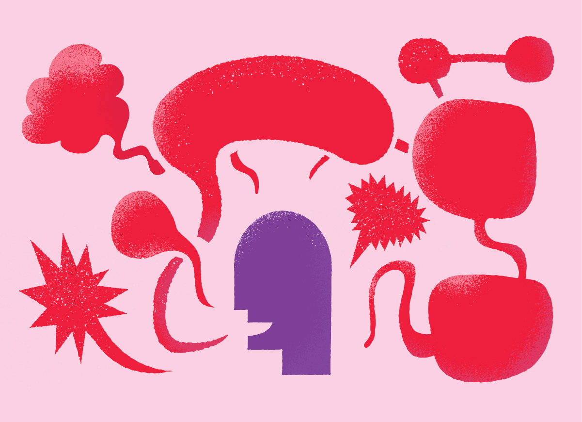
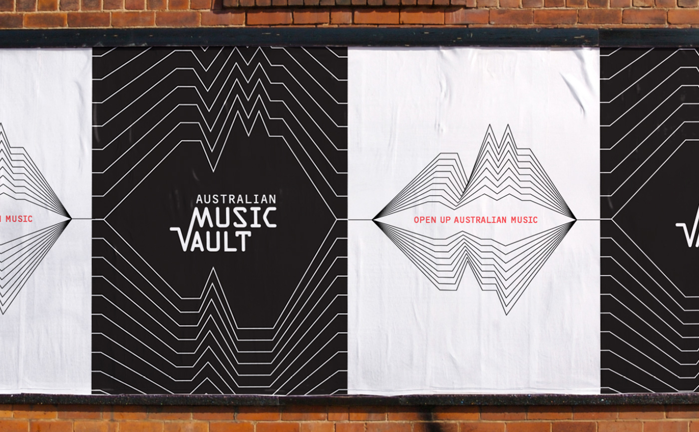
Although colour and type are strong methods to create the visual language, they aren’t as ownable as a shape or motif that reinforces the connection to the brand mark. This could be an actual piece of the brandmark, like the soundwave from Music Vault, the flowing lines of United Energy or it could simply refer to the feeling the brandmark convey’s, like the friendliness and warmth of Mambourin.
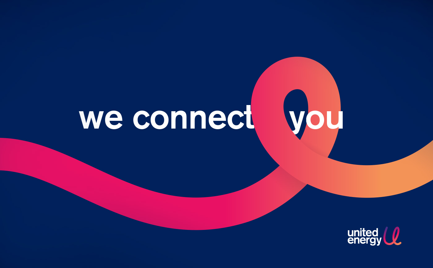
Image – define who you are
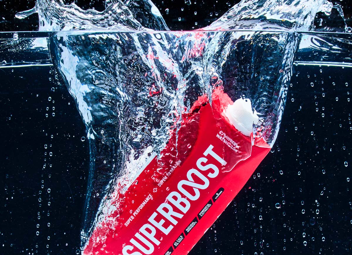
And finally the way in which photography is treated helps define a brand’s unique voice. Are the images close and intimate? Are they abstract, surreal and full of mystery? Perhaps the shape, colour and type interact with the image in an interesting and unexpected way?
The different combinations and possibilities are endless. Creating a brand mark is just one of the first steps in creating your brand. With a visual identity created by Brands to Life®, let’s turn your Brand’s ‘hello’, into a vibrant, memorable and rewarding conversation.