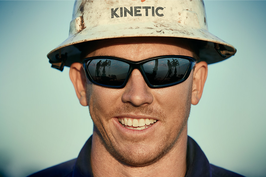
CHALLENGE
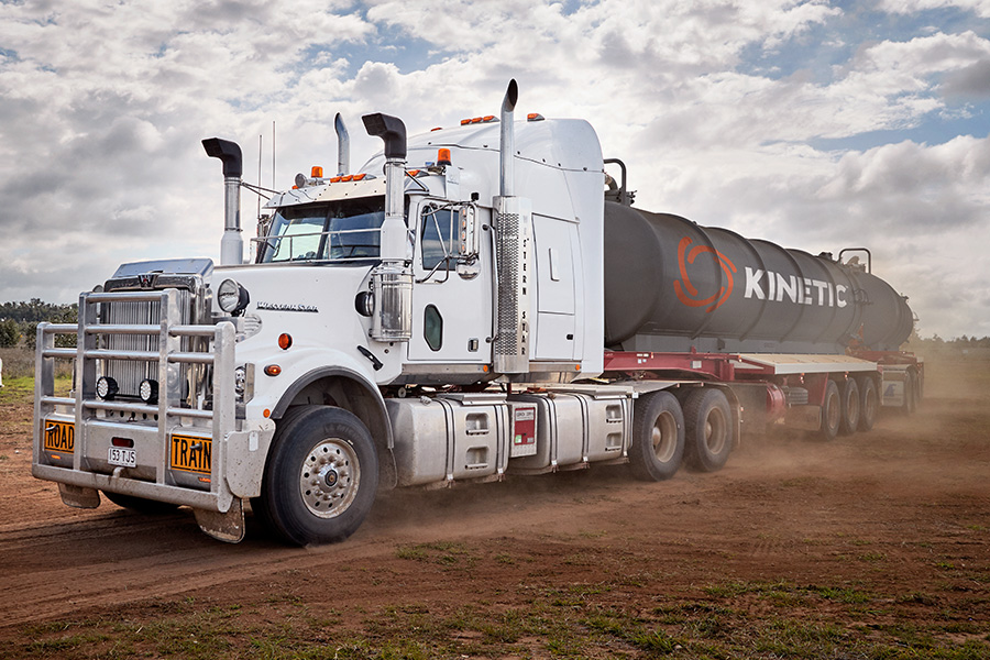
Four companies all servicing the natural resources industry in slightly different capacities were being streamlined into one powerful new company. They needed a confident brand, a brand that all four companies could rally under and that stood for something, so they could stand out against the ‘’big boys’ in their industry.
THINKING
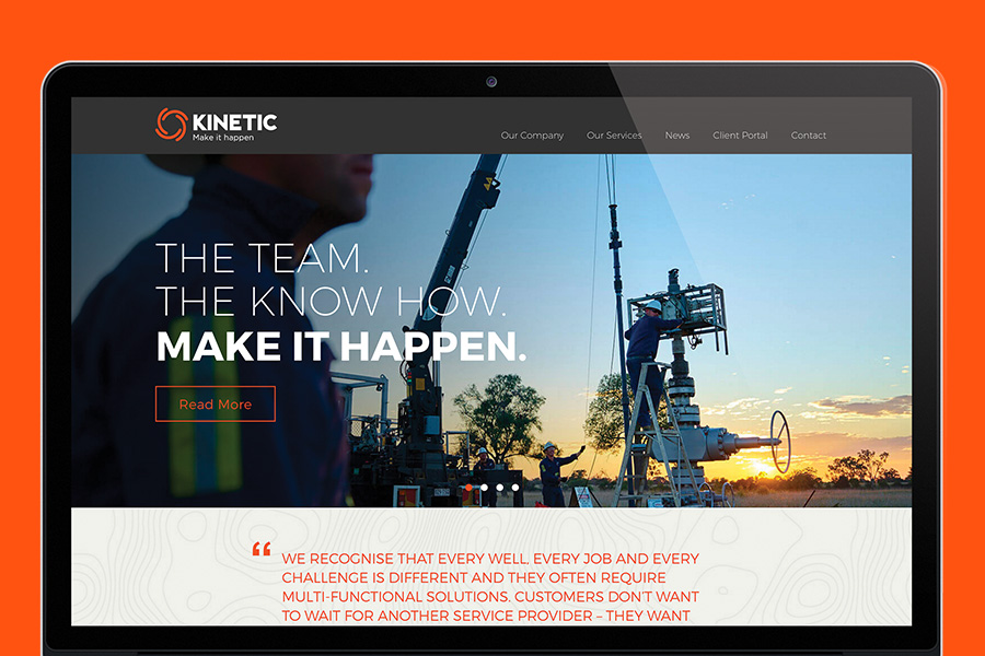
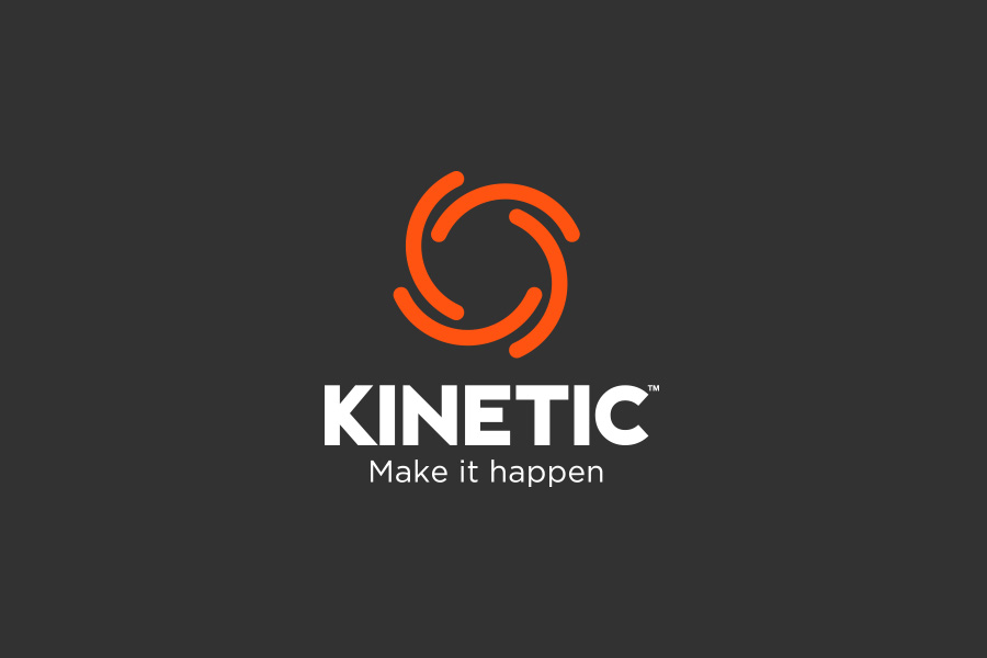
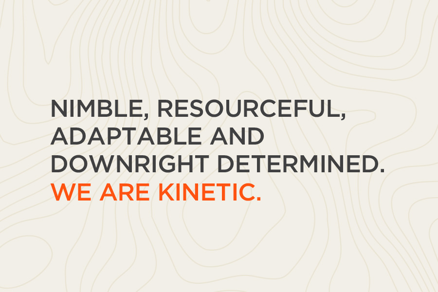
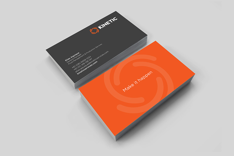
The positioning ‘Make it happen’ was created to show that the newly named Kinetic was the company with right people and the know how to get things flowing and get the job done, on time and on budget. A confident website that embraced these traits and showcase Kinetic’s hard work across the energy and resource landscape. Kinetic’s free-flowing brand mark reflects progress and team work, whilst each of the four curves recognises each of the four businesses that make up this powerful new entity.
IMPACT
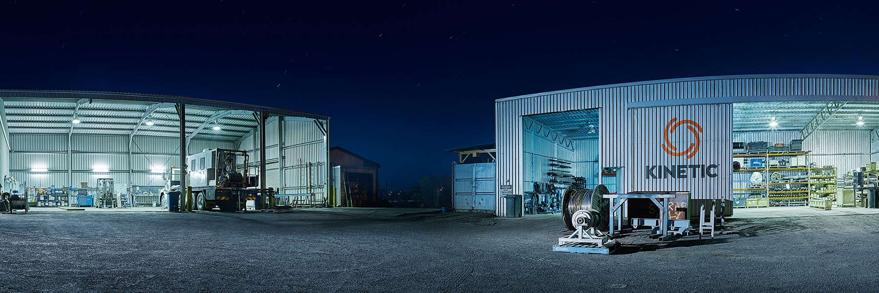
The four businesses all rallied under the single entity Kinetic which was formally announced in early 2017. Since the launch, the business has successfully merged with MPC Group to become MPC Kinetic adopting many of the key brand assets and becoming a bigger player in the delivery of services in the energy and resource construction industry
Brand Strategy + Brand Architecture + Brand Positioning + Brand Story & Voice + Brand Mark + Visual Language + Website Design + Digital Design + Video Content + Internal Stakeholder Launch Campaign + Brand Style Guide